This past week I created a bag for a former coworker of mine. It is very similar to the one that I made for myself, though I added an interior pocket and buckles to the front. It was very rewarding to add in the zipper, since when you hand stitch everything anyway, zippers are much less a nightmare than when using a sewing machine.
I have been using Eco Flo brand Leathercraft Cement to hold everything together while I stitch on this project and have found that it works quite well for this. It doesn't seem to be the strongest of glues, so I don't think I would use it by itself, but it acts splendidly for keeping things nice and flat and smooth while stitching.

Showing posts with label Graphics. Show all posts
Showing posts with label Graphics. Show all posts
19 August 2015

06 May 2015
Origami Blue Jay Tutorial
Hello all,
Its been a while...
Well I did something interesting today so I though I would share!
Make your own ceruleanJAY themed origami bird!

Its been a while...
Well I did something interesting today so I though I would share!
Make your own ceruleanJAY themed origami bird!
19 August 2014
Cool things I learned on Photoshop: Adjustment Layers and Layer Masks
I just got a new job working for Photosynthesis as a graphic designer/retail associate/IT camera "specialist". Part of this new job has made me realize how little I actually understand about Photoshop. As a Linux user, I have had access to several free and super awesome programs such as Inkscape and GIMP. However, I have mostly been learning as I go and playing around with things up until this point. And most of my useful knowledge is wrapped up in Inkscape, a vector program that is very similar to Adobe Illustrator.
However, now I need to learn how to work with raster images! Here are some really simple things I have learned so far that helps with maintaining image info. You want to keep the photo's original information at least until you are done editing to keep the photo from degrading as you edit.

 An Adjustment Layer is useful for changing things like the levels, hue/saturation, brightness/contrast, etc. Each time you use one of these, it removes some of the original data/info from the picture, which eventually can show up as patchy looking shading or poor transitioning colors.
For a visual, here is what happens to the levels when you adjust them without using an adjustment layer. The white you see between the bars after the adjustment is representative of the missing info!
To avoid this, we can simply select the adjustment layer button as seen above (looks like half black/ half white circle). This will add a layer to the picture to keep the original intact in case you want to edit it more later. If you decide you were too drastic when you brought the arrows in, for examle, you can adjust them back out a little later. This could not be done with just a straight level adjustment, because the level adjuster has erased the outsides when you brought them in earlier.
For fun, I have an image that I made an adjustment to using the adjustment layer levels.

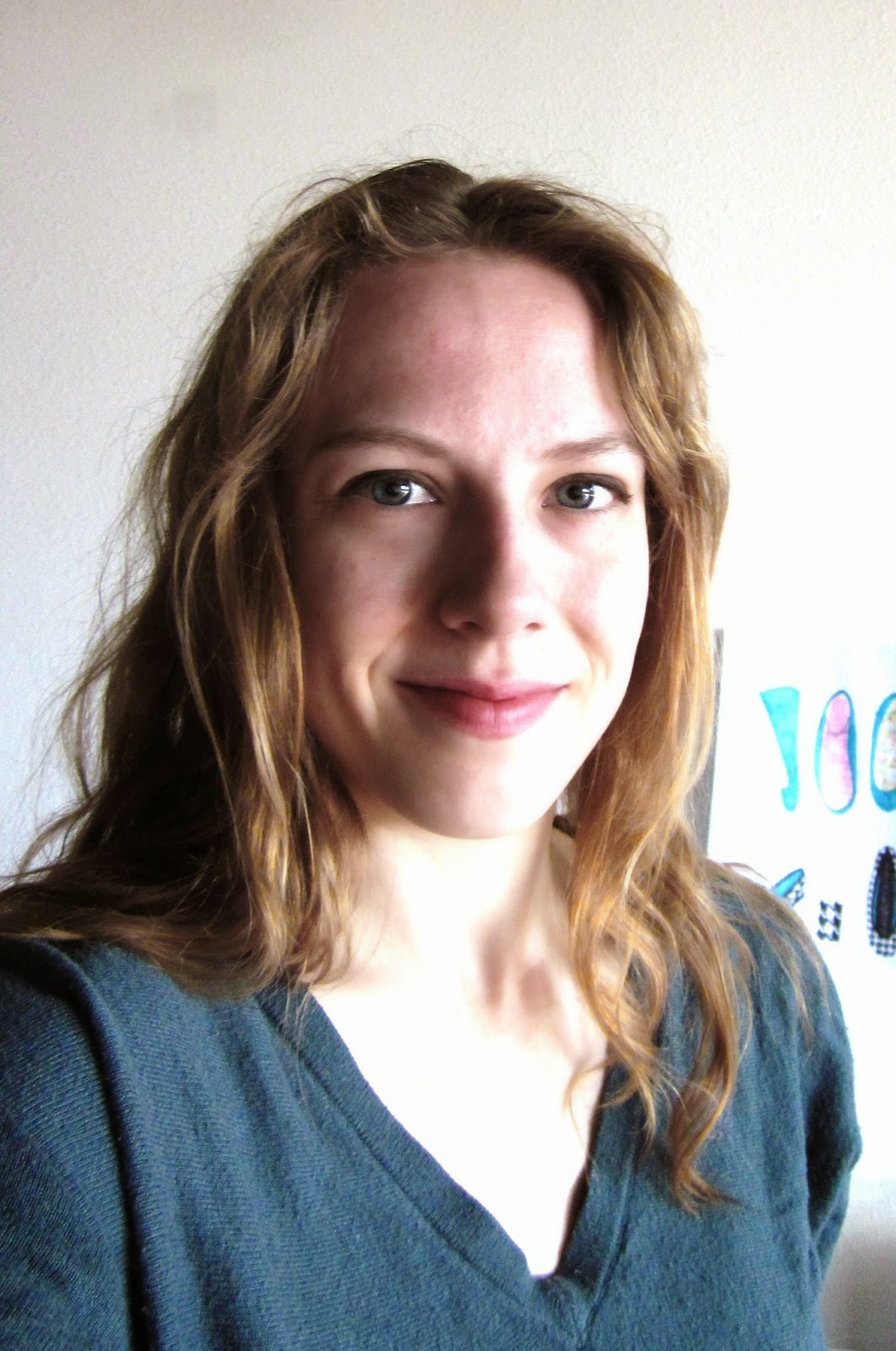 A layer mask is useful if you want to change or adjust only parts of an image. Here I am using it to brighten up the background of my picture. First you will want to make a copy of your background and make adjustments as necessary. I brightened my image quite a bit to remove some of the grey background from the picture. You can see this layer at the right.
As you can see, the picture doesn't look very good, but I just want to focus on the background right now, and that part looks good, so I will leave it like this for now.
Now, using the button you saw in the first image of this post (its the white circle one), I am going to create a layer mask. You can choose to have it all white or all black. Areas that are black represent transparent parts, and white is visible. I want the brightened background to show up, so I am going to make the layer black, and use the brush tool color the background area white. Make sense?

So the image on the left side represents what was visible in the white areas, and invisible in black areas. So in the end only the background of the photo is brightened, and the original picture shows through in the black areas.
And because we were geniuses and used a layer mask, the original photo remains unaltered in case you decide the background does not need to be lightened! Woo!
Here is a picture of the before and after on the layer mask. Pretty good for a "bored one day selfie"!!

P.S. Photoshop people! Am I making a fool of myself or is my info accurate?? I am learning as I go, and would LOVE not to lead people astray! Please leave any comments about and inaccurate info I have above! Thanks!
However, now I need to learn how to work with raster images! Here are some really simple things I have learned so far that helps with maintaining image info. You want to keep the photo's original information at least until you are done editing to keep the photo from degrading as you edit.
Two Important things!
Adjustment Layer
For a visual, here is what happens to the levels when you adjust them without using an adjustment layer. The white you see between the bars after the adjustment is representative of the missing info!
To avoid this, we can simply select the adjustment layer button as seen above (looks like half black/ half white circle). This will add a layer to the picture to keep the original intact in case you want to edit it more later. If you decide you were too drastic when you brought the arrows in, for examle, you can adjust them back out a little later. This could not be done with just a straight level adjustment, because the level adjuster has erased the outsides when you brought them in earlier.
For fun, I have an image that I made an adjustment to using the adjustment layer levels.
Layer Mask
A layer mask is useful if you want to change or adjust only parts of an image. Here I am using it to brighten up the background of my picture. First you will want to make a copy of your background and make adjustments as necessary. I brightened my image quite a bit to remove some of the grey background from the picture. You can see this layer at the right. As you can see, the picture doesn't look very good, but I just want to focus on the background right now, and that part looks good, so I will leave it like this for now.
Now, using the button you saw in the first image of this post (its the white circle one), I am going to create a layer mask. You can choose to have it all white or all black. Areas that are black represent transparent parts, and white is visible. I want the brightened background to show up, so I am going to make the layer black, and use the brush tool color the background area white. Make sense?
So the image on the left side represents what was visible in the white areas, and invisible in black areas. So in the end only the background of the photo is brightened, and the original picture shows through in the black areas.
And because we were geniuses and used a layer mask, the original photo remains unaltered in case you decide the background does not need to be lightened! Woo!
Here is a picture of the before and after on the layer mask. Pretty good for a "bored one day selfie"!!
P.S. Photoshop people! Am I making a fool of myself or is my info accurate?? I am learning as I go, and would LOVE not to lead people astray! Please leave any comments about and inaccurate info I have above! Thanks!
23 July 2012
Wedding Color Theme using Photographs

When planning a wedding, it's easy to have a color scheme or theme to help narrow down the millions of options a bit. While many people choose one or two complementary colors, I found a way to ensure colors match while allowing for more than just the traditional one or two color scheme approach. Having several complementary colors helps to add depth and interest to a wedding. However, if the colors do not match well, the event can seem disorganized and amateur.
If you are not gifted with knowing what colors match, or you are simply not in the mood to spend hours and hours to come up with a palette of complimentary colors, here's a trick I implemented that worked quite nicely.
Flip through a magazine (fashion, nature, home, doesn't really matter) or go to Google images and look for photographs that are striking to you, and contain colors that you might like at your wedding or other event. I Googled phrases like, "stormy sea" "folk art" and "autumn leaves."Try to pick images that look professionally photographed or designed.
Next, take that image you found and pick spots of color from out of the images you have picked. Try to pick a range of bold colors, pastels, and dark colors. This is not necessary, but is a good way to ensure that your color scheme is not overwhelmingly bright (think circus) or too washed-out looking.
 |
 |
Above is a set of colors I chose from images I found on Google. Notice how in almost all options I have a very dark color, one that is almost white, and one or two brighter colors. I used an eyedropper tool to pick exact shades from the images, and filled rectangles with each color using a free program called Inkscape. You could also use a program like Adobe Illustrator or you can also get out crayons or colored pencils (provided you have a large pack with many colors) to create a palette for future reference and planning.
Good luck!
Subscribe to:
Posts (Atom)
Popular Posts
-
 So yesterday we were talking about making an Ojibwe Pucker Toe Moccasin Pattern. Today I am going to show you how to sew your moccasins toge...
 -
 I thought I would share a little about how I developed the pattern for the current project I have just completed, my Moccasin Boots.
 -
 CLICK HERE for more views of the finished product on at my Etsy store! So I decided it was high time for another shoe tutorial! I have...